The Silent Crisis of Notification Fatigue on Modern Smartphones
For years, the smartphone experience has been defined by a constant, overwhelming stream of alerts. While notifications are essential for staying connected and productive, the sheer volume often leads to what experts call digital overload or notification fatigue. Users find themselves constantly distracted, forced to triage dozens of alerts every hour, making the notification shade a source of anxiety rather than utility.
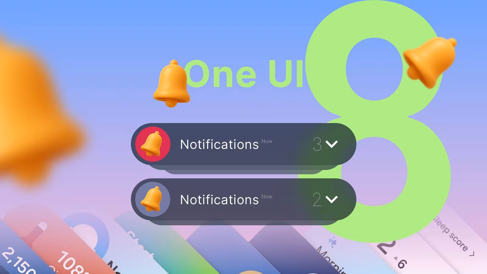
Turning off all notifications is not a viable solution for most users who rely on their devices for work, communication, and essential updates. The challenge, particularly for power users on Android, has been finding a middle ground—a way to receive crucial information without the visual and mental clutter. With the rollout of One UI 8 (Samsung’s latest software layer, based on the current Android iteration in 2025), Samsung introduced a subtle but profound change to notification management that fundamentally alters this dynamic.
This specific tweak, often overlooked in major feature announcements, transforms the way users interact with their phone, turning a chaotic notification center into a clean, manageable dashboard. It represents a significant step forward in prioritizing digital well-being within the core operating system experience.
One UI 8’s Genius Solution: Condensing the Clutter
The core problem with previous notification systems was redundancy. If a user received five emails, three messages, and two app updates, the notification shade would display ten distinct, full-height cards, forcing the user to scroll extensively just to see what was happening. While basic grouping existed, it often failed to adequately condense alerts, especially when multiple apps were vying for attention.
The critical change in One UI 8 is the refined ability to group notifications by app icon, shifting the visual priority from the content of the alert to the source of the alert. Instead of seeing a cascade of individual cards, the user now sees a highly condensed view where multiple pending alerts from a single application are collapsed into a single, compact entry, often represented solely by the app’s icon and a small numerical badge indicating the count.
The Mechanics of the Tweak
This new default or easily accessible setting fundamentally changes the interaction flow:
- Initial View: The notification shade shows a minimal list of app icons, each representing one or more pending alerts. This provides an immediate, low-stress overview of which apps need attention, rather than what the specific content is.
- Triage: The user can quickly scan the icons (e.g., Gmail, Messages, Slack) and instantly determine which apps are high priority and which can wait.
- Expansion: Only when the user taps on the specific app icon does the full list of individual notifications for that app expand below, allowing for focused review and action (reply, dismiss, archive).
This system moves the user from a reactive, overwhelmed state to a proactive, focused state. Instead of being forced to process every alert simultaneously, the user chooses when and where to engage with the accumulated notifications.
The Practical Impact on Daily Device Usage
For experienced smartphone users, this seemingly minor interface adjustment has major psychological and practical benefits. The author of the original analysis noted that this change was the single most impactful tweak to their daily phone use, transforming the device from a demanding taskmaster into a helpful tool.
1. Reduced Cognitive Load
When the notification shade is full of 20 distinct cards, the brain must process 20 separate pieces of information. By collapsing these into 5 or 6 app icons, the immediate cognitive load is drastically reduced. The brain only needs to recognize the familiar app logo, not read the first line of every email or message.
2. Faster Triage and Action
In high-volume scenarios—such as receiving 30 notifications overnight—the condensed view allows the user to immediately dismiss low-priority apps (like game updates or social media likes) with a single swipe, without ever having to expand the full list. This saves time and mental energy, making the act of clearing notifications quick and satisfying.
3. Enhanced Focus
By keeping the notification shade clean and minimal, the user is less likely to be drawn into endless scrolling. The visual peace encourages users to address the alerts and return to their primary task, rather than getting lost in the rabbit hole of accumulated digital demands.
“The ability to instantly see a clean slate, even when I know I have pending alerts, has fundamentally lowered my anxiety about checking my phone. It’s the difference between walking into a messy room and walking into a room where everything is neatly filed away.”
Implementing the Notification Grouping Feature in One UI 8
While the exact location of this setting may vary slightly depending on the carrier and specific device model, the core functionality is managed within the main Settings application under the Notifications menu. Users who are still experiencing notification clutter should ensure they have the most efficient grouping method enabled.
Step-by-Step Guide for Samsung Users:
- Access Settings: Open the main Settings app on your Samsung device running One UI 8.
- Navigate to Notifications: Tap on the Notifications menu.
- Review Notification Pop-up Style: Ensure your pop-up style is set to the most compact option, often labeled Brief or Condensed, which supports the icon-based grouping.
- Manage Advanced Settings: Look for Advanced notification settings or Notification grouping.
- Enable Smart Grouping: Verify that the system is set to group notifications intelligently, prioritizing the collapsing of multiple alerts from the same source into a single entry represented by the app icon.
For users coming from older Android versions, the transition to this condensed view may initially feel restrictive, but the long-term benefits for focus and digital well-being are substantial. This feature leverages the power of visual recognition (app icons) over textual information (alert content) to manage information overload.
Key Takeaways: The Future of Digital Well-being
Samsung’s implementation of this refined notification grouping in One UI 8 highlights a growing trend in mobile operating system design: moving away from constant engagement metrics and toward user quality of life. The best features are often not the flashiest, but the ones that quietly solve persistent, frustrating problems.
This specific tweak is a powerful reminder that managing notifications effectively is crucial for maintaining a healthy relationship with technology. By giving the user control over the presentation of the alerts, Samsung empowers them to decide when and how to engage, rather than being dictated by the device.
Summary of Benefits:
- Reduced Anxiety: A clean notification shade minimizes the feeling of being constantly behind or overwhelmed.
- Improved Efficiency: Quicker scanning and mass dismissal of low-priority alerts.
- Focused Interaction: Encourages users to address notifications in focused sessions rather than continuous, fragmented checking.
- Visual Clarity: The use of app icons provides immediate context without requiring extensive reading or scrolling.

Conclusion
The One UI 8 notification grouping feature is a prime example of how thoughtful software design can dramatically improve the user experience. It addresses the fundamental tension between the need for connectivity and the desire for peace. For Samsung users struggling with notification fatigue, exploring and enabling this condensed grouping method is highly recommended. It is the subtle, expert-level refinement that makes the daily use of a powerful device manageable, ensuring the phone serves the user, rather than the other way around.
Original author: Faith Leroux
Originally published: November 9, 2025
Editorial note: Our team reviewed and enhanced this coverage with AI-assisted tools and human editing to add helpful context while preserving verified facts and quotations from the original source.
We encourage you to consult the publisher above for the complete report and to reach out if you spot inaccuracies or compliance concerns.